Pulsar is a start-up that sells manufacturing technology for factories and industrial companies. With their state-of-the-art sensors and software their clients get real time data and analytics from their machines and their factories performance.
Challenge
Improve the users’ experience for both public and private platforms. How? By redefining our design system, implementing brand new features to stay up to date with our clients needs and reimagining our Pulsar’s user experience.
Role
Product Designer
Timeline
2024 – Ongoing
Team
Business Analyst, Back-End Development, Customer Success and Front-End Development
Skills
UX Design, UI Design and Design Systems
OVERVIEW
Creating great software for machine data and management in factories.
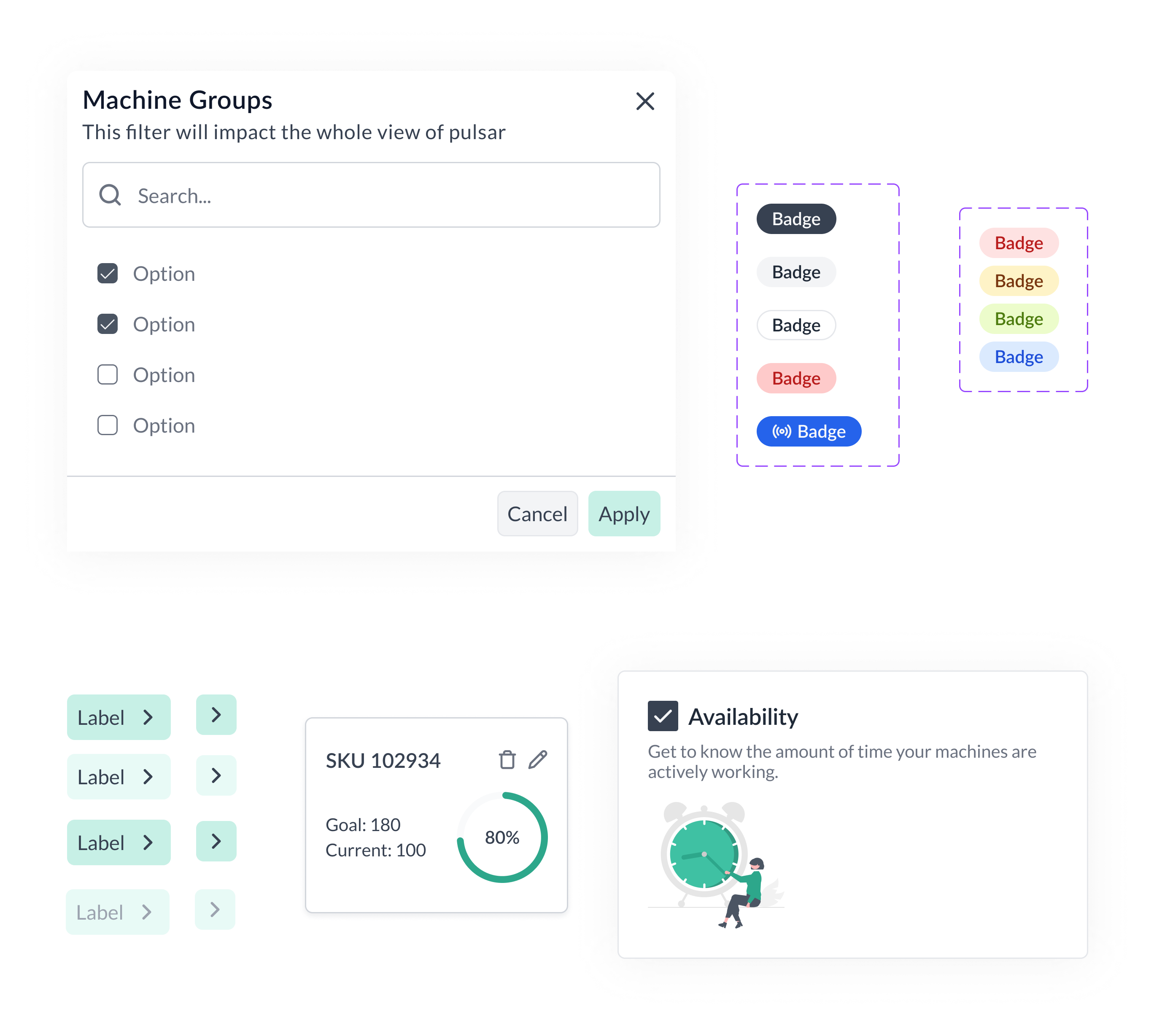
Creating a design system
Even though Pulsar already had a starter design system, the consistency and application of their designs was lacking. It was important to have a cohesive experience as well as flexible and broad components that could be reused.
Benefits of our design system:
Clear documentation and change log management for each new component or changes.
The developers had a source of truth document from which they could develop components in Storybook.
Overall, the time of hand-off after creating our components cut by approximately 50%.
About the design system
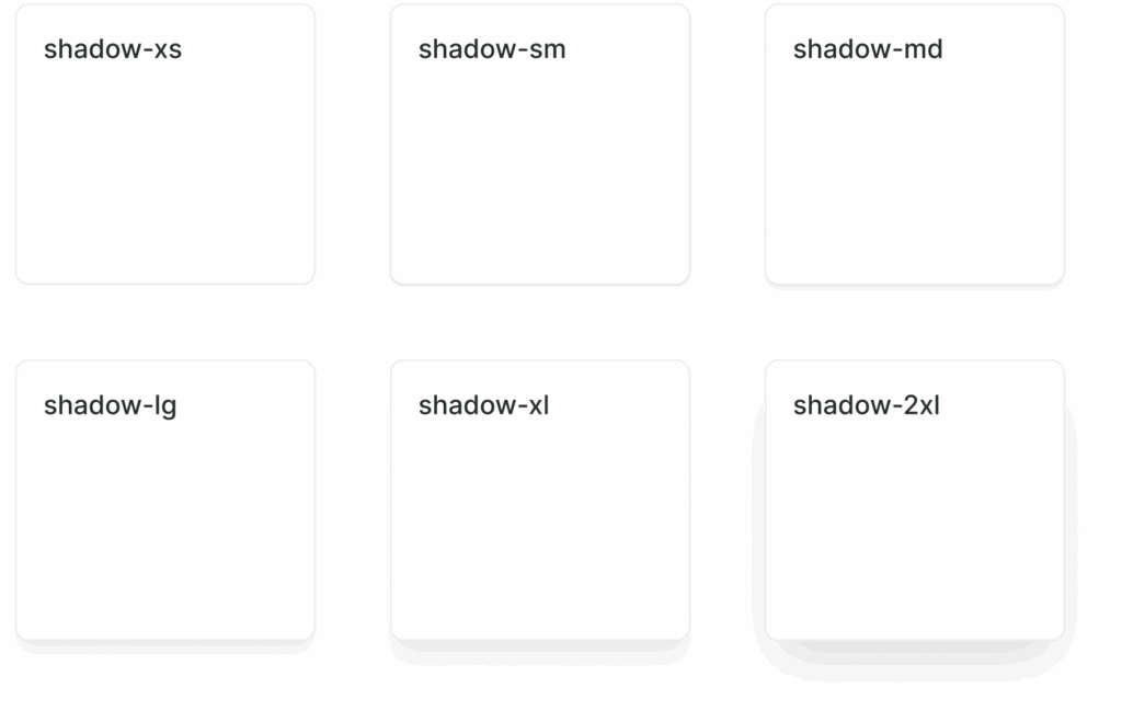
I created the Design System based on existing libraries like Untitled UI and ShadCN, this is because our developers were very comfortable using Tailwind for the CSS conventions.
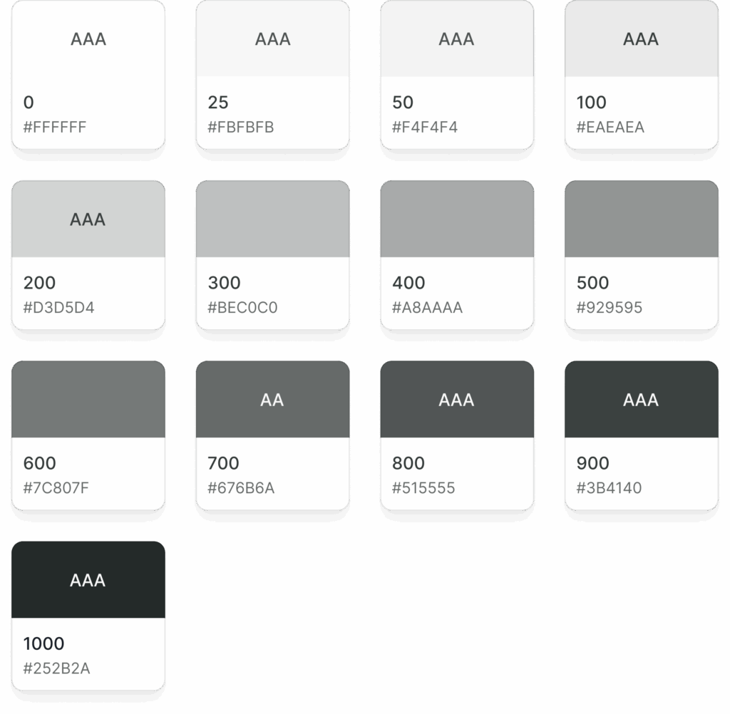
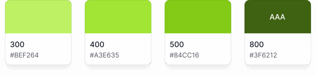
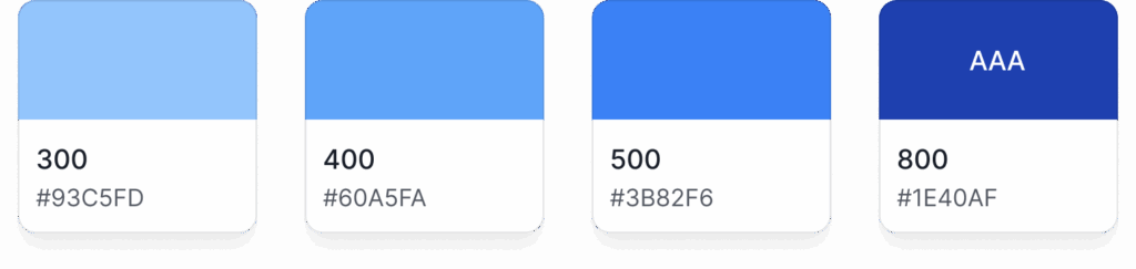
GRAY PALETTE
Gray is a neutral color and is the foundation of the color system. Almost everything in UI design — text, form fields, backgrounds, dividers — are usually gray.
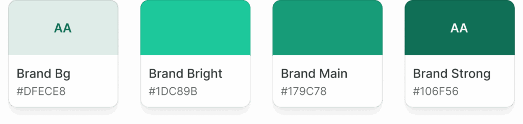
BRAND PALETTE
The brand color is your “primary” color, and is used across all interactive elements such as buttons, links, inputs, etc. This color can define the overall feel and can elicit emotion.
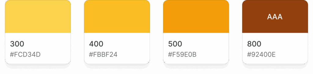
SYSTEM COLORS
I created some system colors: error, warning, success, info. Over 40 shades for these colors.
Crafting a UX research methodology
It became obvious down the road that we needed a realiable way to understand our users more than just basing ourselves on hypotheses.
This is where UX research became an imminent need. So, in order to get off the ground I designed a process that could help our start up fast-paced environment necessities.
These were some of the challenges to consider while creating an UX research process:
Users are factory workers and they don’t have too much time to invest.
Users usually don’t answer surveys and only give us detailed answers when we are on a call with them, so surveys were a no-no.
We had to move fast and delivery quickly results to avoid churn in customers, this narrowed down our methodology choices for getting insights. So usability tests were not very viable.
We opted for starting our challenge by using a mix of interviews and live A/B testing.
Redesign of Flows
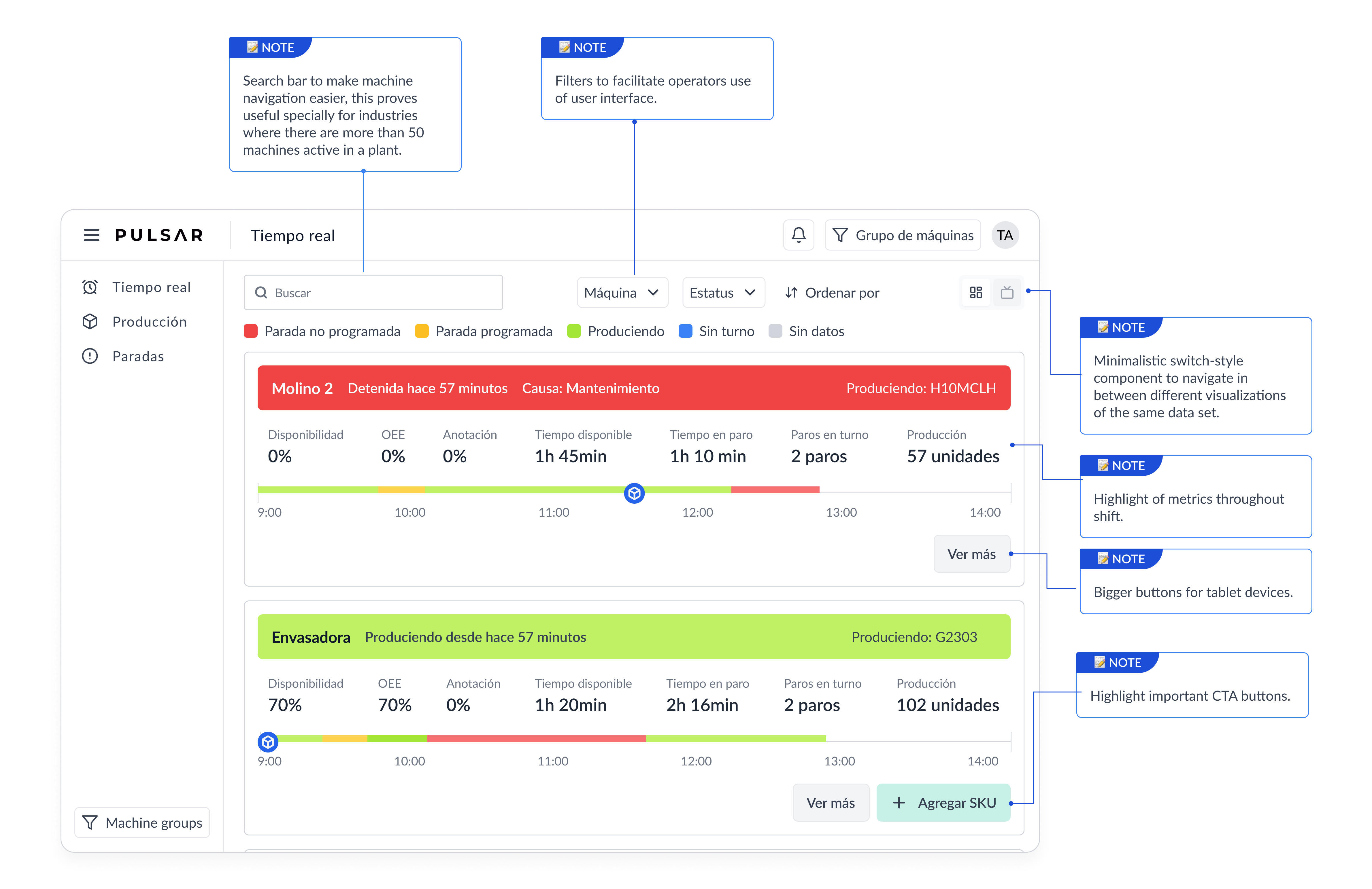
Parallel to updating and adapting our new components from the design system, we took on the task of implementing this new components into reimagined user flows.
We analyzed our users needs with the help of our Customer Success team, by understanding the tickets we created a roadmap and backlog of the most important product features to implement.
We started by jotting down our ideas on a whiteboard and creating wireframes, this way our UI preferences and biases didn’t get in the way
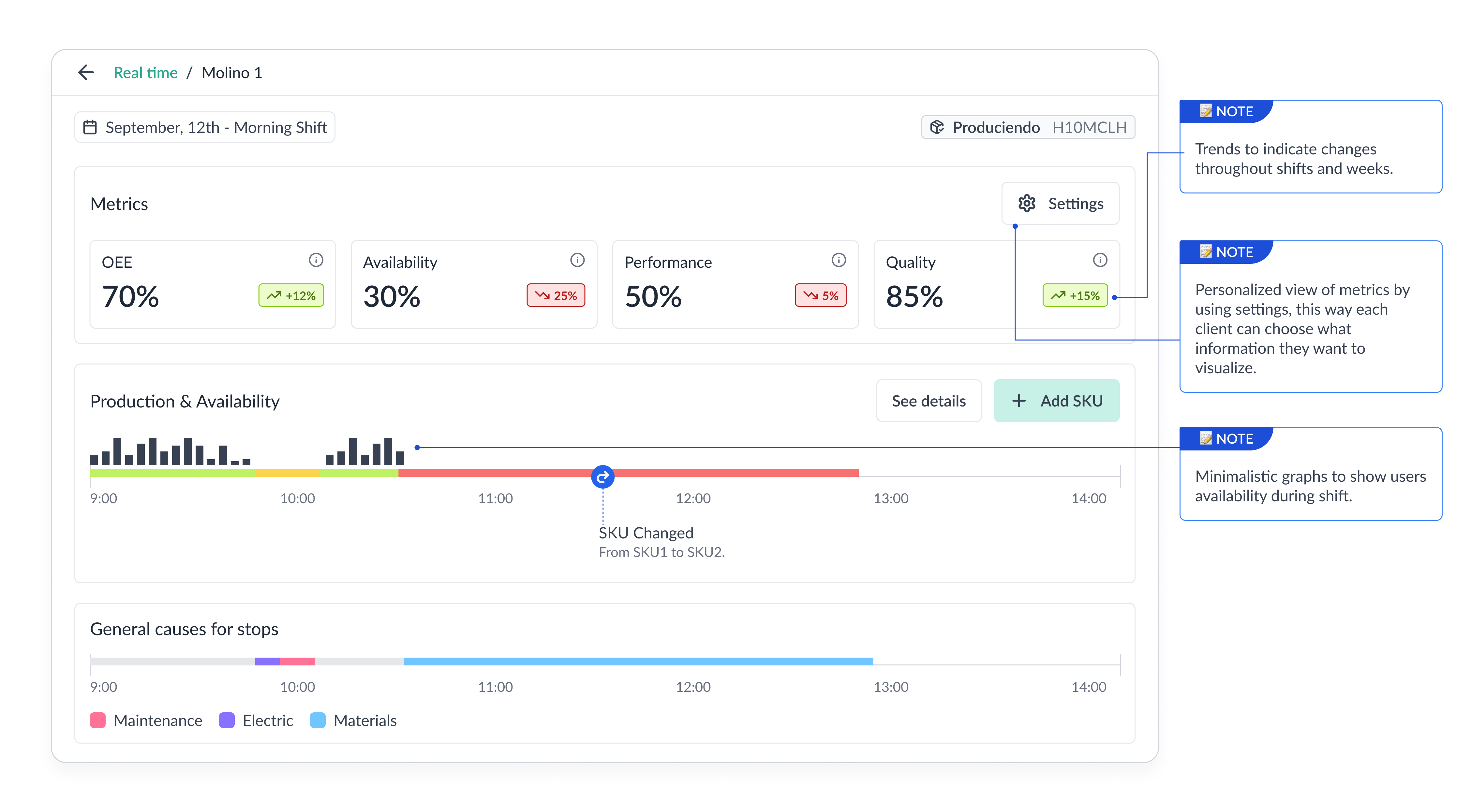
The impact of our new components and reimagined user experience.
Some major challenges with these features where finding a good balance between having too much information and keeping it minimal.
We had to keep in mind our users’ needs such as having the necessary information to navigate their day to day job at factories while also understanding a simple view of complex topics.
Because we have different types of users in the same app, we needed to then create customizable features.
I realized that a common problem that the platform experimented was the overload of numbers and data in a single page, this is why we need a redesign of flows expanding information using:
full screen modals,
side sheets
tooltips.
In this way, only the most important information for the general user would be visible and for niche cases, they could see additional info by clicking on “See more” buttons. Having “Detail” pages gave us much more real-estate of screens and space to work with, without having to compromise the usability of the platform.
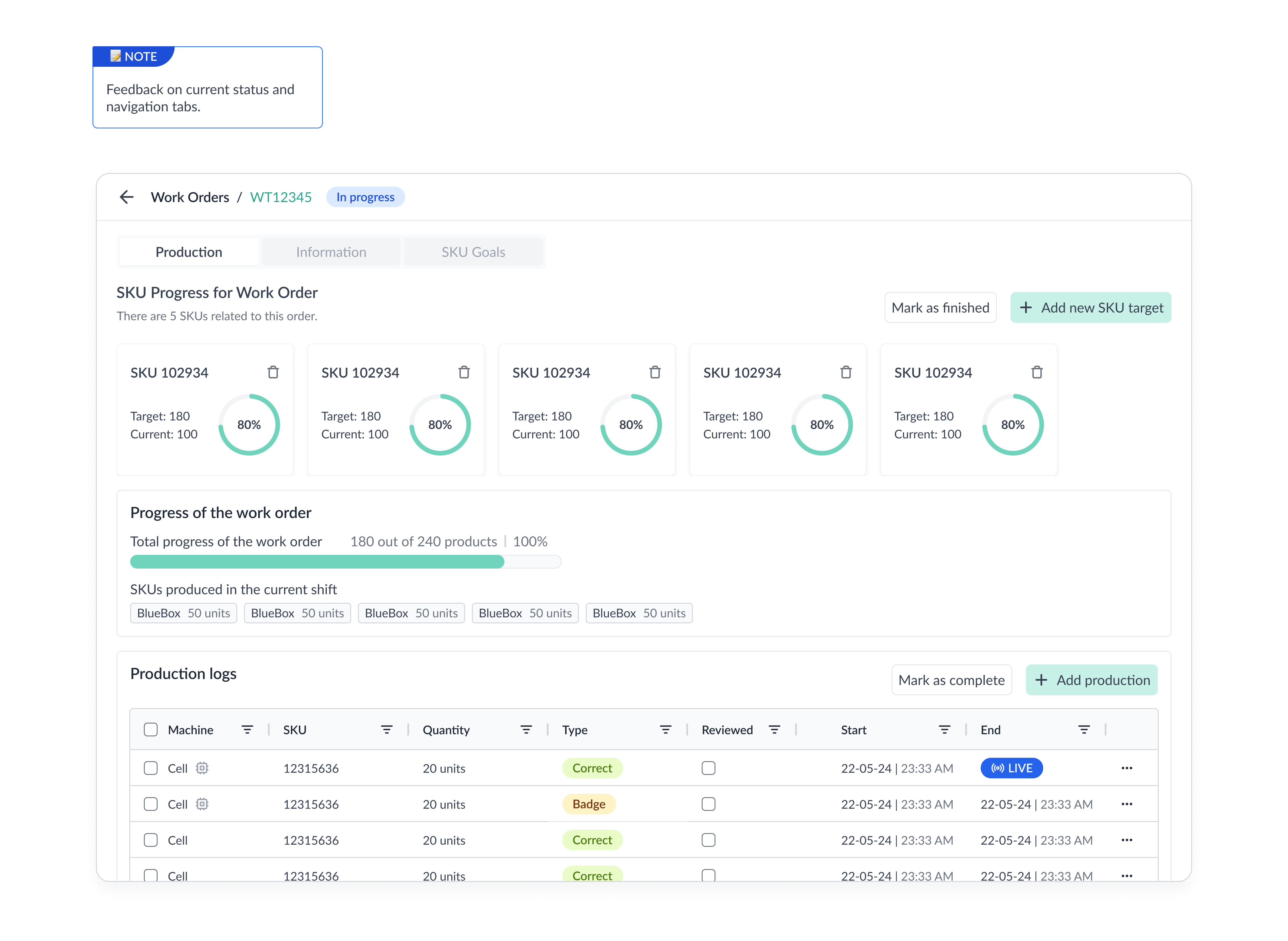
Before my entry to the company, another problem was also the lack of visual feedback. Because Pulsar is used by operators who interact with the app to fulfill their daily job activities, it’s important to gamify and give the user feedback on the tasks that he’s completing. Without a clean but striking UI, sometimes they got lost in rows and rows of tables, getting drowned by data.
By segmenting sections into boxes with clear titles, call to actions and descriptions, they now had more simple approach to their progress on work orders.
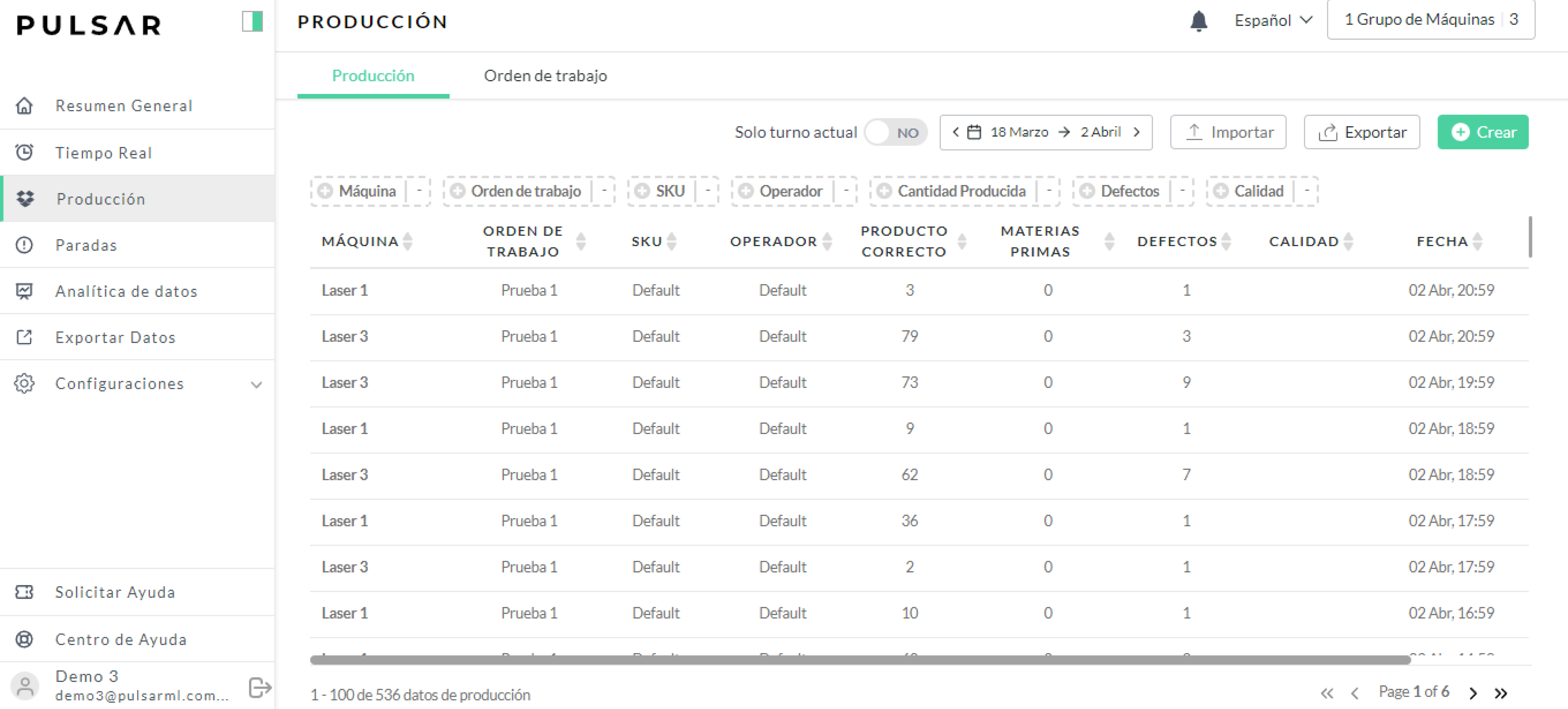
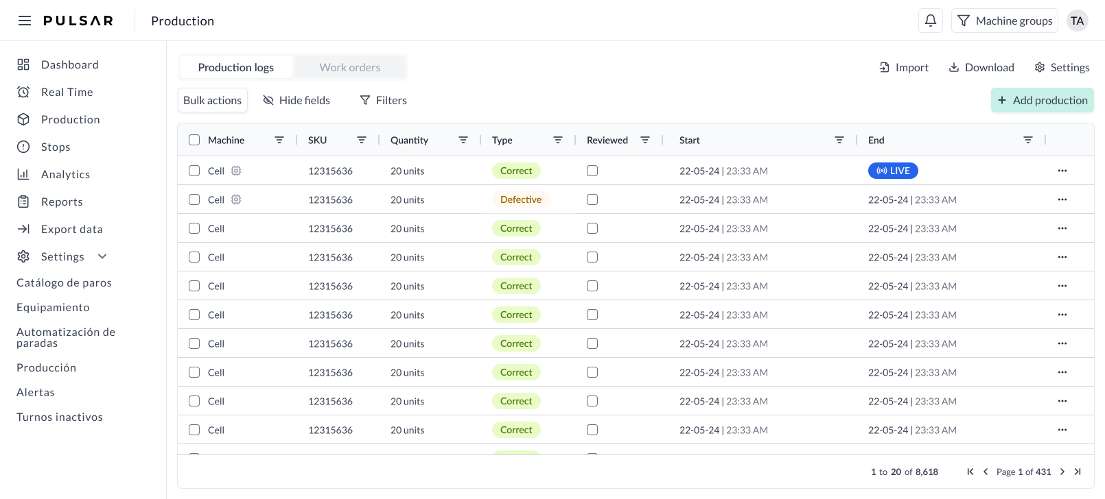
Slide with mouse to discover the before and after…
In this image, by sliding, you can see the old version and the new UI. The goal was to have a cleaner version of our production logs table.
🏆 Some wins!
Became a dual role: QA and designer to accomplish the level of quality we wanted on the designs.
Learned more of front-end and back-end, specially about releases and how PR's work on GitHub.
Created a complete and solid design system that migrated nicely from Figma into Storybook.
Some things to improve on…
Because of the fast-evolving nature of a start-up sometimes it was hard to catch up with requirements and time frames. This made UX research very difficult and we had to rely on Customer Success team as well as Zendesk tickets to receive direct feedback from users.
I wish I could have deployed a user research project to get faster and cleaner feedbacks.


